abCam App Redesign

Project Overview
Time
2 months
Project Brief
abCam is an app provides users remote accessibility to keep an eye on their home, yard, office, or anywhere they have the IP camera. Users can also review videos of recent events and set the cameras via this App. The main app icon design is based on the family because they are the main concerned users. Using a “home” image with a cam like the eye of the house, makes people feel safe and protected.
Role
UI design,
Interaction design
Goal
This app was created to provide for different ipcam manufacturers and will be bundled with our cloud system. So it can be clear that the users are the general users, and we are mainly concerned with family users at this stage. The other users are the stakeholder- ipcam manufacturers.
The main idea of the design is to make each camera relatively independent while giving the end-user a simple operation so that different manufacturers have better requirements when they have different needs.
Wireframe
This app has three main parts:
The first part. The most important part is the Events page. This is the main page of the app. It has two main functions watching activity videos and on-demand videos. On the Events page are three main parts, one is the tab, so that users can see all the cameras’ activities and the activities of the respective cameras. Then there is the entrance to a “Watch Live Now”. From here, the user can select the camera and watch the live stream. The third part is two half activity cards, which are a video, but in the form of a card. Why do we use the form of card: because these videos are different from the videos on youtube we usually watch, these videos are very short, usually around 15 seconds. Then the content will be boring. Most of them may be someone walking, or a dog’s bend. In general, the video will have a list view mode, the user browses what they want to see, and then they have a player mode after the point, mainly to optimize the viewing experience. This time, because the video is very short, we hope not to have too many different modes. We only have one form of a card. When the user clicks, it will play directly on the card.
Launch flow

Main Events Page

The second part is the devices (Cameras) page, this is the second important part, users can manage their own multiple cameras, then they can also set up each camera.
Devices Page

The third part includes setting and help.
Settings Page and Hep Page

Final Design
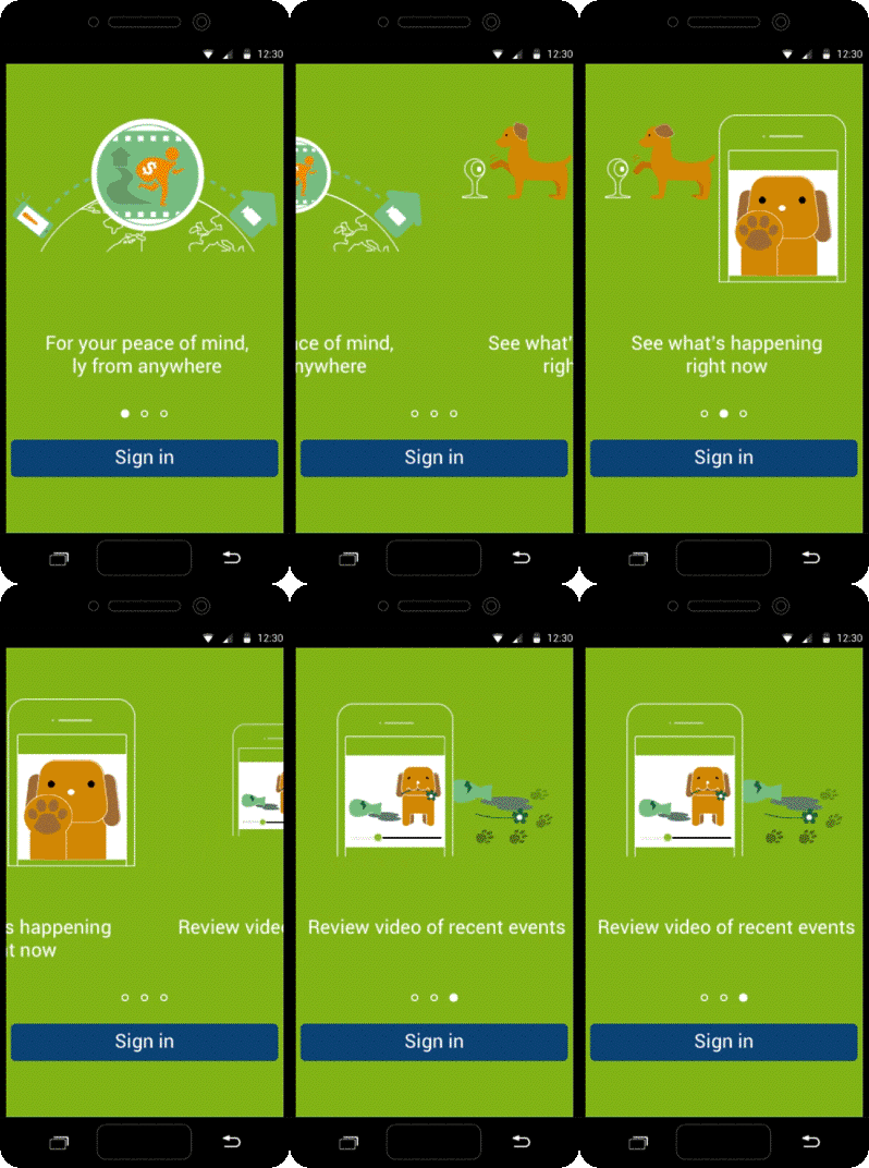
Welcome page design
I designed animation sequences, using three simple life scenes by outline style, makes user easier to understand the product’s main functions.

Main UI
The app’s iconography style was a thin outline pattern similar to iOS7 and implemented as font icons. As a small design and development group, the strategy to use font icons across mobile apps was to reduce the time needed to create specific platform assets. In cases where more complex graphics were required I created multiple platform-specific image assets. After finished the layouts, I used Invision to create the UI prototype, it made our stakeholders easy to get understand the product’s interaction flow, and I iterated continually and got good feedback from stakeholders and external usability testing.


Learning and Takeaway
-
Icon fonts were adequate for the development, reducing time spent on creating platform-specific assets.
-
Using the prototypes to help the teams and stakeholders understand the product's interaction flow improve development efficiency.
-
Continuous iteration and usability testing enhanced the app's usability and user experience.